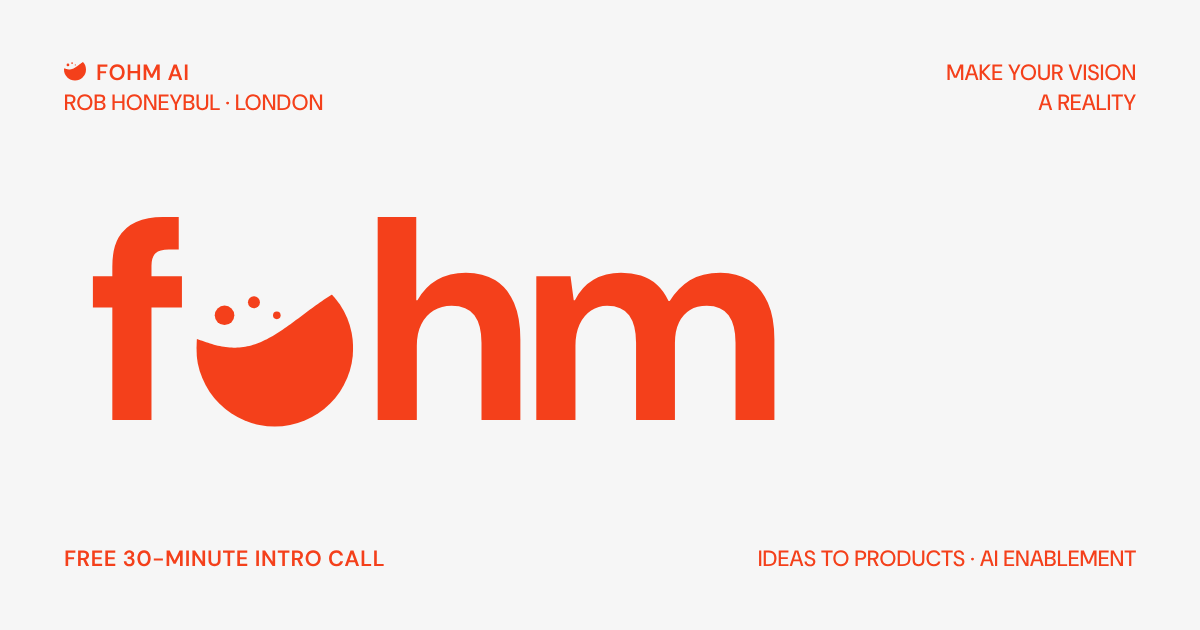
Logo, colour and type for Fohm AI: technical leadership and AI engineering by Rob Honeybul. The name is foam, respelled: the white water a wave leaves behind.
Logo, colour and type for Fohm AI: technical leadership and AI engineering by Rob Honeybul. The name is foam, respelled: the white water a wave leaves behind.
The logo is fohm in DM Sans Bold, lower case, with the symbol standing in for the o: its bubbles rise into the space above the letters. The lockups add AI in DM Sans. Use the logo alone once the name is clear, the horizontal lockup in narrow bars and the stacked one where there is room.
The symbol is a round of sea at the waterline: solid water below a rising swell, three bubbles lifting off it. It is the o in the logo, and stands alone where there is no room for the name: icons, avatars, the corner of a page.
In square spaces (favicons, LinkedIn and social avatars, app icons) the symbol sits centred on a solid square. Use paper on signal for avatars, signal on paper for favicons.
Signal orange carries the brand. Use it for the mark, headings and labels; keep body copy in ink. Paper is the page. There is no dark version: the brand lives on light.
#F4401B · rgb(244 64 27)#F6F6F6 · rgb(246 246 246)#161616 · rgb(22 22 22)DM Sans is free (SIL Open Font License) on Google Fonts, and it does everything: bold for the logo and headings, semibold uppercase for labels, light uppercase for marquees, regular for reading.